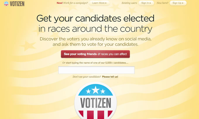
Whenever I deliberately visit or stumble upon a website, the first page I see can either turn me off or get me hooked. That’s why I am a firm believer of creating landing pages that work because really, it determines whether or not a website visitor would bother to click further.
For this post, we’re going to talk about the introduction to landing page design. This can be especially helpful for those who’s just starting out or even those who are looking to give their website a complete do over.
To get us started, let’s define what a landing page is.
A landing page is a direct sales page that a visitor sees after clicking on a link or other source. It’s practically the first page anyone lays his or her eyes on that’s why it can either make or break your cause.
Here’s an example of how a landing page looks like, a very good example from Square.

As you can see, there’s the main cause on top, followed by the form and the main benefit, with the product visual on the side. That’s basically the main elements of a landing page but I will get deeper into details in a bit.
What is the purpose of a landing page?
The main purpose of a landing page is to show the intent of your business. Whether it’s the latest news, discounts or a limited offer, a landing page should be able to speak for your cause.
We now move on to a deeper understanding as to what landing page design should be and shouldn’t be. For things to be easier, I’m going to show you different landing pages examples as we go along.
Elements of a Landing Page Design
In order for you to get a blow by blow of what effective landing page design is all about, below are the different elements that should be present and strategically placed in your landing page.
1. Headlines
This is practically the very first thing anyone reads in your landing page. It should be short, catchy and direct to the point. Most readers wouldn’t make the effort of reading around your page so make sure your headline sums up everything you want to say. Moreover, ensure that the headlines in your page are enough to entice them even more.
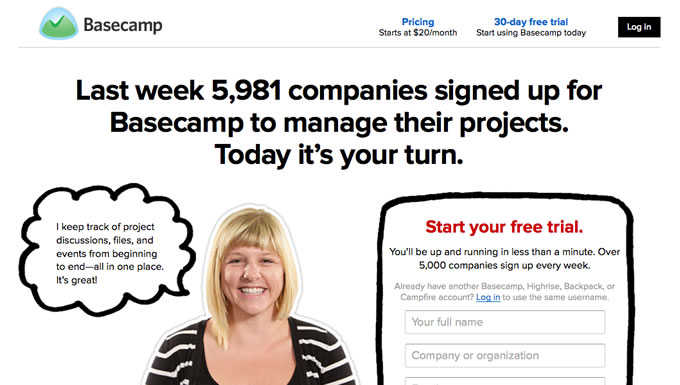
37Signals did a very good example on this. This is a very attracting and captivating headline.
See how you can easily notice what the landing page is all about?
2. Visuals
Visuals have a very powerful impact over landing pages. It will help a lot if the images or videos you’re about to place directly relates to your copy and to your cause. Besides, it’s one of the most eye-catching elements of your landing page so it’s best to be mindful to be original and personalized.
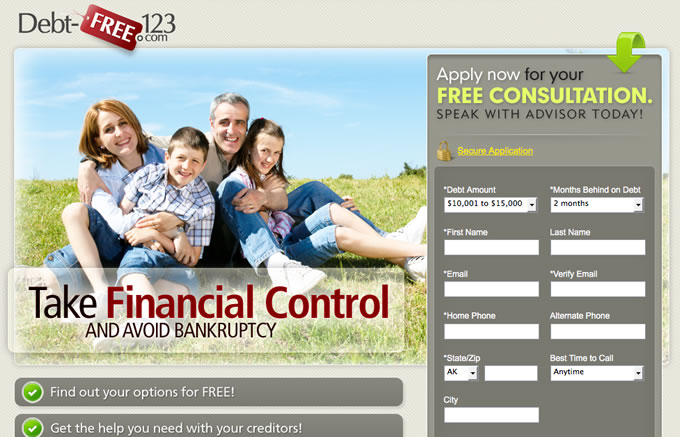
Here’s one landing page that use the visual to impart to you the experience of being debt free.
3. Colours
Another vital element of landing pages is colours. There’s nothing like setting the mood and tone of your cause. A lot of this transmitted energy comes from the hues you choose. If you want to emit a sense of luxury and style, you can’t go wrong with black. If you are trying to sell organic products, then green and brown are still the best picks. Remember, your colors can either be an eyesore or a complete eye candy so be very careful in picking your colours.
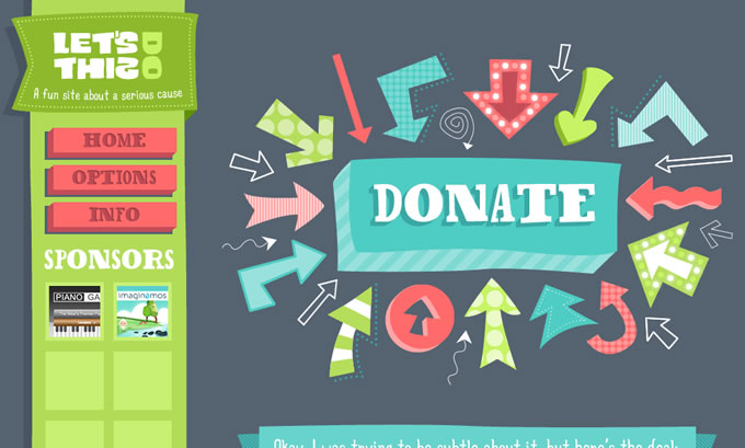
Here’s the perfect example of complementing colours in a landing page:
As you can see in this page, the colour contrast and the visual clue bring all our attention to what is the most important of this page - donate.
4. Font
Wording can be very tricky when it comes to landing pages. Not only do you need perfect grammar, you also need to have a good diction and styling of the font. After the headlines and images are noticed, then readers will proceed on reading what you have to offer them.
Choosing the right font style to marry with the entirety of your landing page is critical to your campaign’s success. Here’s one example of a very unified landing page with a complementing text:
The above landing page completely banked on the way their text appears. Along with the imaginative visuals, the font perfectly fits.
5. Calls To Action
Possibly the most important component of a landing page is your call to action. Even if your images are well photographed, your wording well thought of and your font well styled but your call to action weak, then your landing page is pointless.
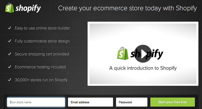
Your call to action is basically what you want your market to do. Whether it is to subscribe, buy or follow you in your social network accounts, it should be crystal clear in all ways. If you can do it as short but completely cohesive, then you’re good to go. Below is what I think a great example of a call to action:
You can see how direct and how intriguing the entire landing page is. It appears very simple but very, very strong.
Landing pages are a vital part of your online marketing. If you’re not able to pull it off perfectly, it can cause you a lot of loss. Keep these basic information in mind so you can start off at the right foot.

